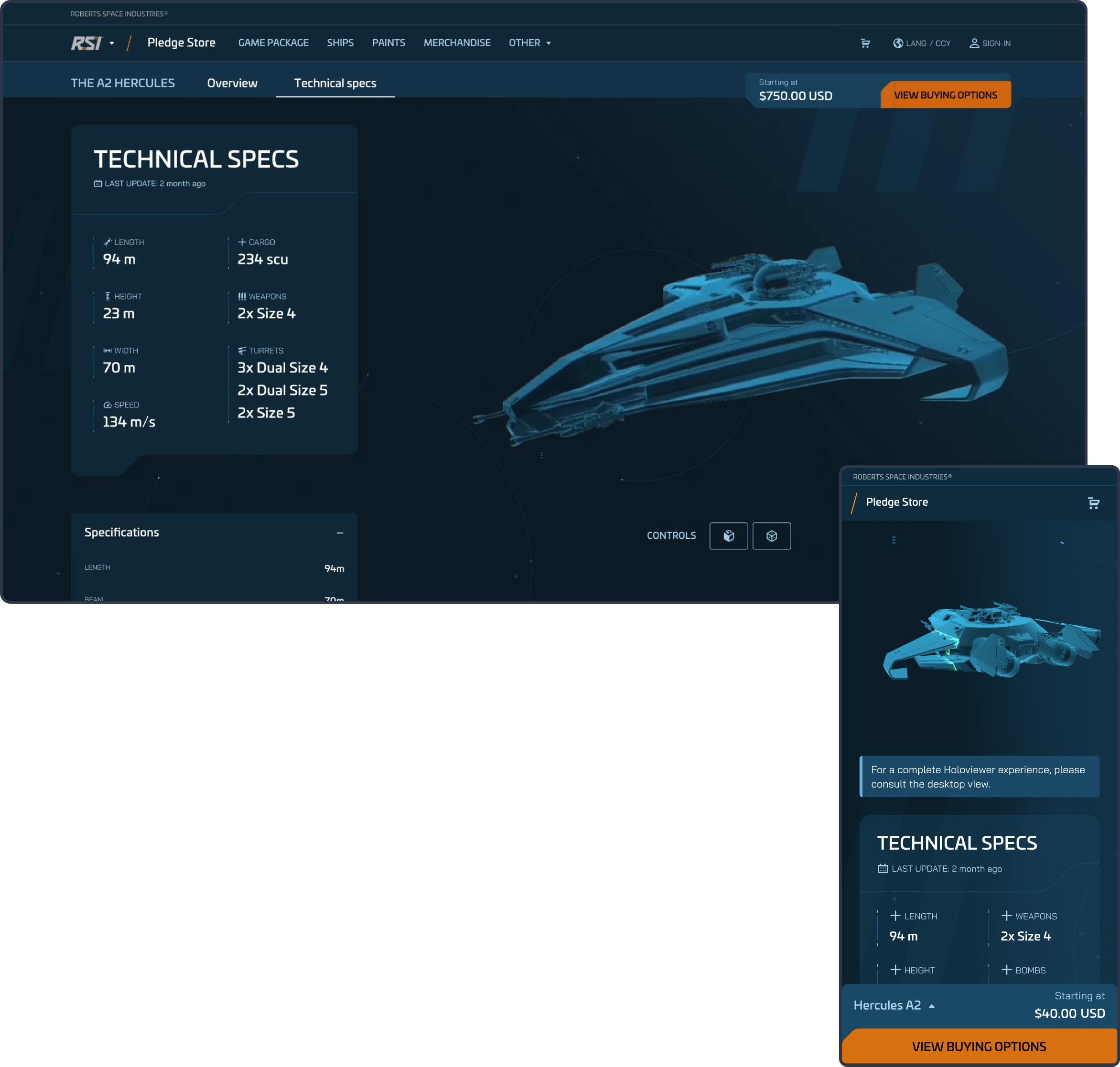
For nearly five years, I’ve been contributing to the evolution of Star Citizen’s web ecosystem, moving from UI Designer to Product Designer with growing responsibilities. Throughout this journey, I’ve played a key role in projects connected to the platform’s e-commerce experience — a core area where design decisions directly impact both business performance and player engagement.
During this time, I’ve helped design and deliver a wide range of digital products and immersive experiences that strengthened the online platform. Today, this ecosystem serves as the foundation of a global community of more than 5.6 million players, supporting one of the most successful crowdfunded initiatives in history with over $800 million raised.
Design Processes
1 - Discovery Phase
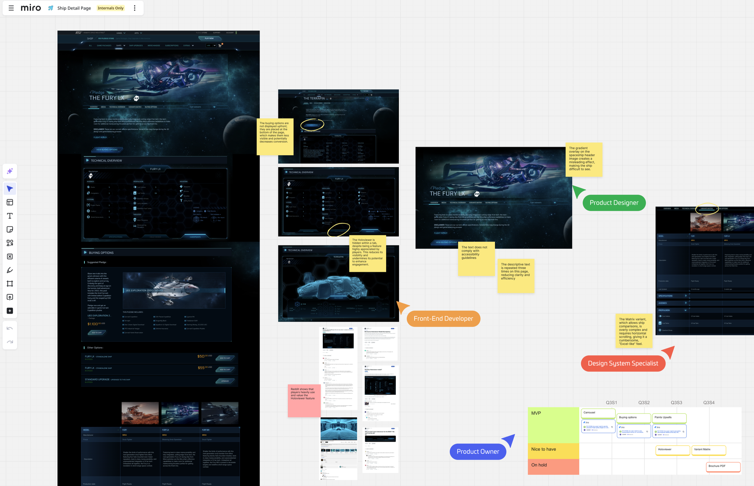
During the initial Discovery phase, we analyze the current page to identify pain points, usability issues, and areas for improvement. This includes a thorough review of existing user flows, interface elements, and content structure.
In parallel, we explore platforms frequented by target players, such as Spectrum and Reddit, to gather real feedback on features they enjoy and those they find frustrating. This research helps inform design decisions and ensures that the redesign aligns with both user expectations and business goals.
Benchmark Phase
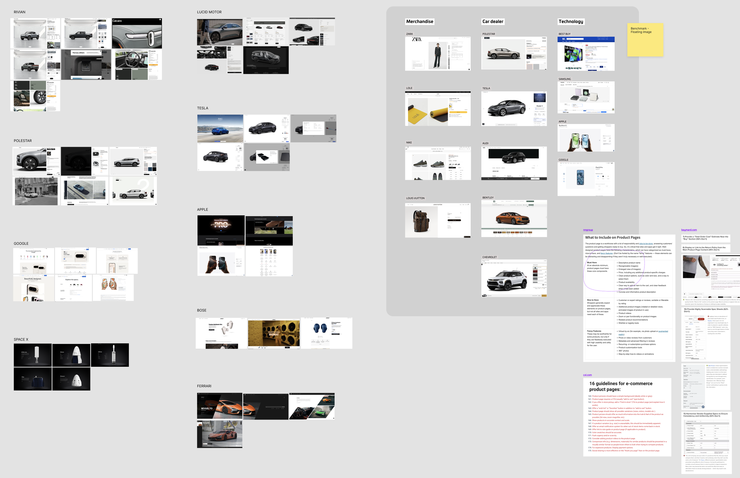
During the benchmark phase, we focus on analyzing websites and platforms that share similarities with our product, particularly car dealer sites, since we are selling ships. We examine how they present products, handle comparisons, and guide users through purchase flows. In addition, we review expert articles and research from sources such as Nielsen Norman Group to gather best practices in UX, interface design, and user engagement. This combination of industry and research insights helps inform design decisions and ensures a user-centered, effective e-commerce experience.
To improve the Ship Detail Page, I collaborated with key internal teams to align on business goals and user priorities. I also analyzed community feedback on forums and Reddit to identify what players valued most, such as the Holoviewer, as well as their frustrations with buying options, comparisons, and accessibility.
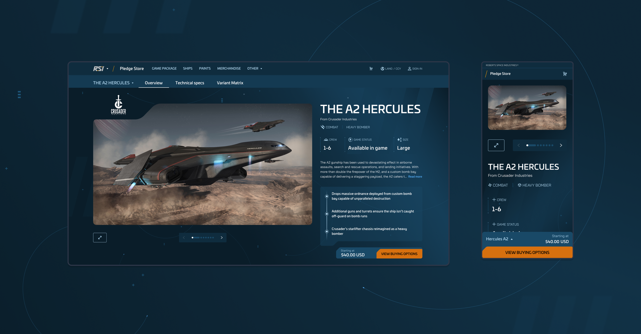
These insights guided the redesign of the page, ensuring that players could easily access critical information, explore ships through interactive features, and transition smoothly toward purchase, all while keeping the experience immersive and consistent with the RSI universe.
2 - Ideation Phase
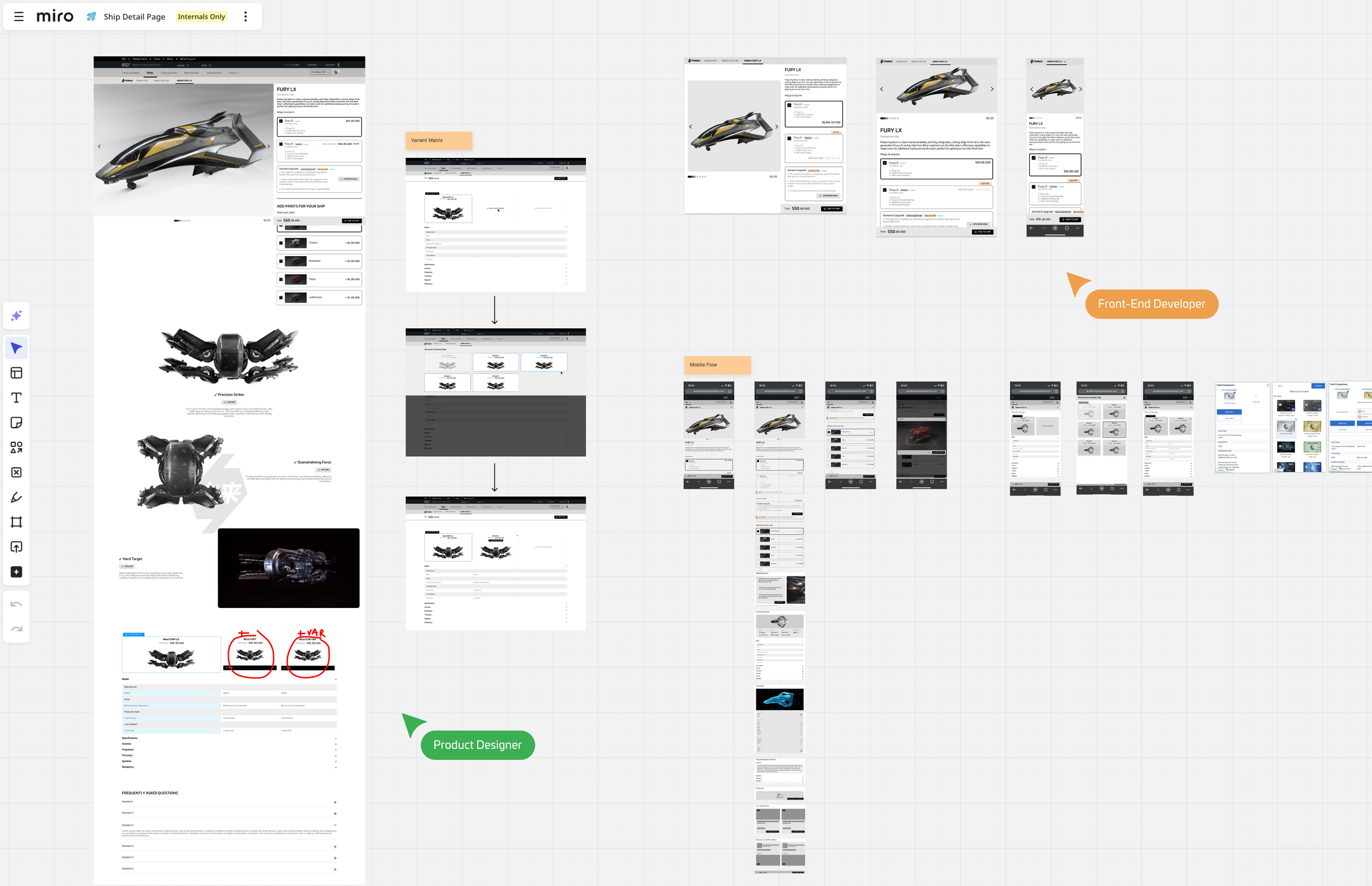
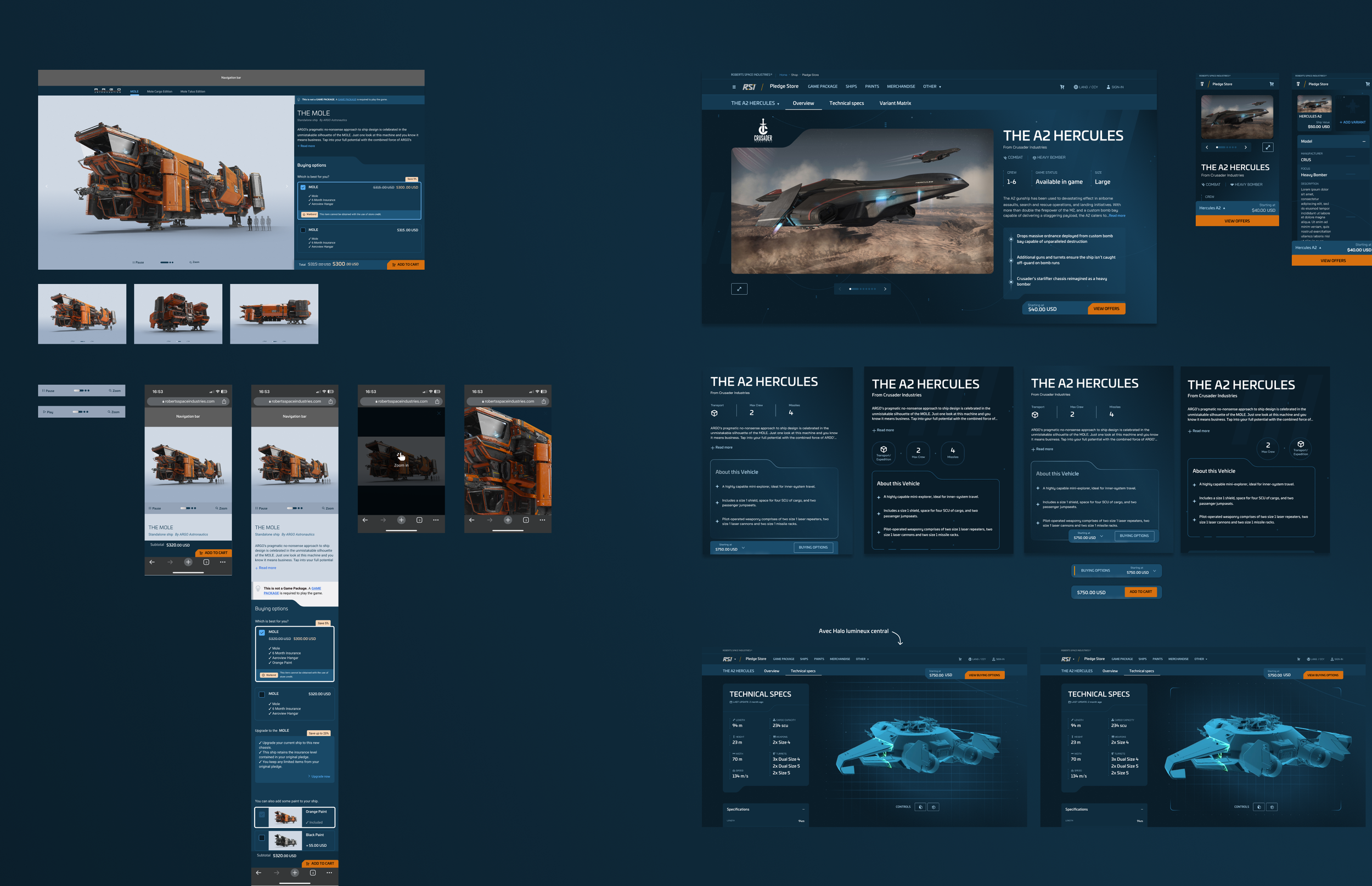
At this stage, I created high-level wireframes and exploratory prototypes to visualize different flows and interactions. The goal was to test how the user journey would behave in practice and quickly validate design directions before moving into detailed production.
This phase also marked stronger collaboration with developers, allowing us to gather immediate technical feedback, anticipate constraints, and ensure feasibility early in the process.
3. Designer Conception
In this phase, I experimented with UI concepts inspired by the spatial and futuristic identity of Star Citizen. The goal was to let players easily explore both the visual and technical aspects of each ship. The challenge was to strike the right balance: creating an immersive experience that conveys the scale and atmosphere of the universe, while keeping the interface minimal and unobtrusive. This approach ensured that users could engage with the design without distraction and quickly access key technical information.
Moodboard & Visual Direction
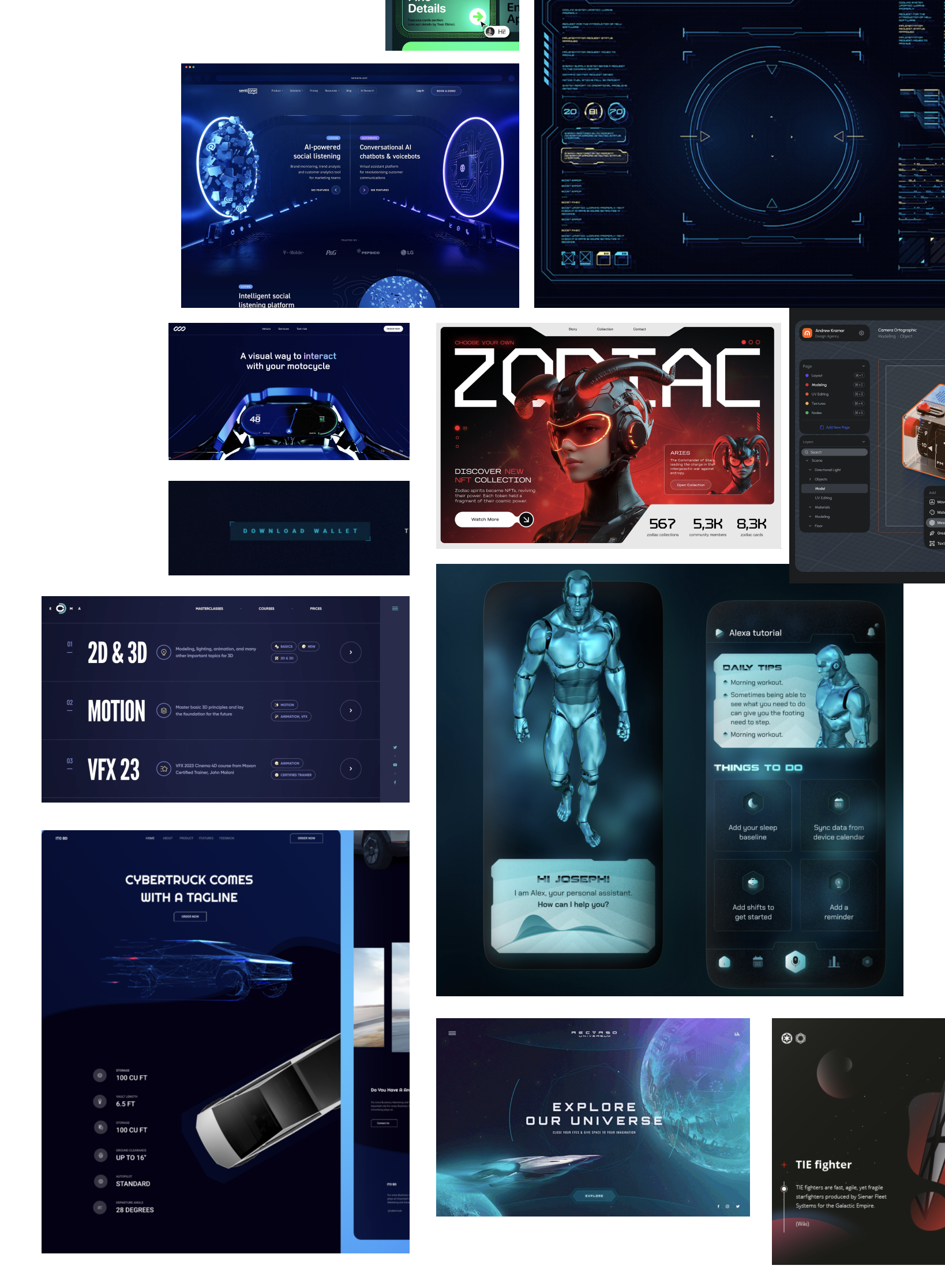
To immerse players in the Star Citizen universe, I developed moodboards inspired by sci-fi aesthetics. This step allowed us to define the visual language — colors, lighting, typography, and textures — that would support the sense of discovery and reinforce the futuristic identity of the ships. By setting a strong art direction early, we ensured consistency across UI elements while creating an atmosphere that draws users deeper into the experience of exploring each ship.
4. Production Phase
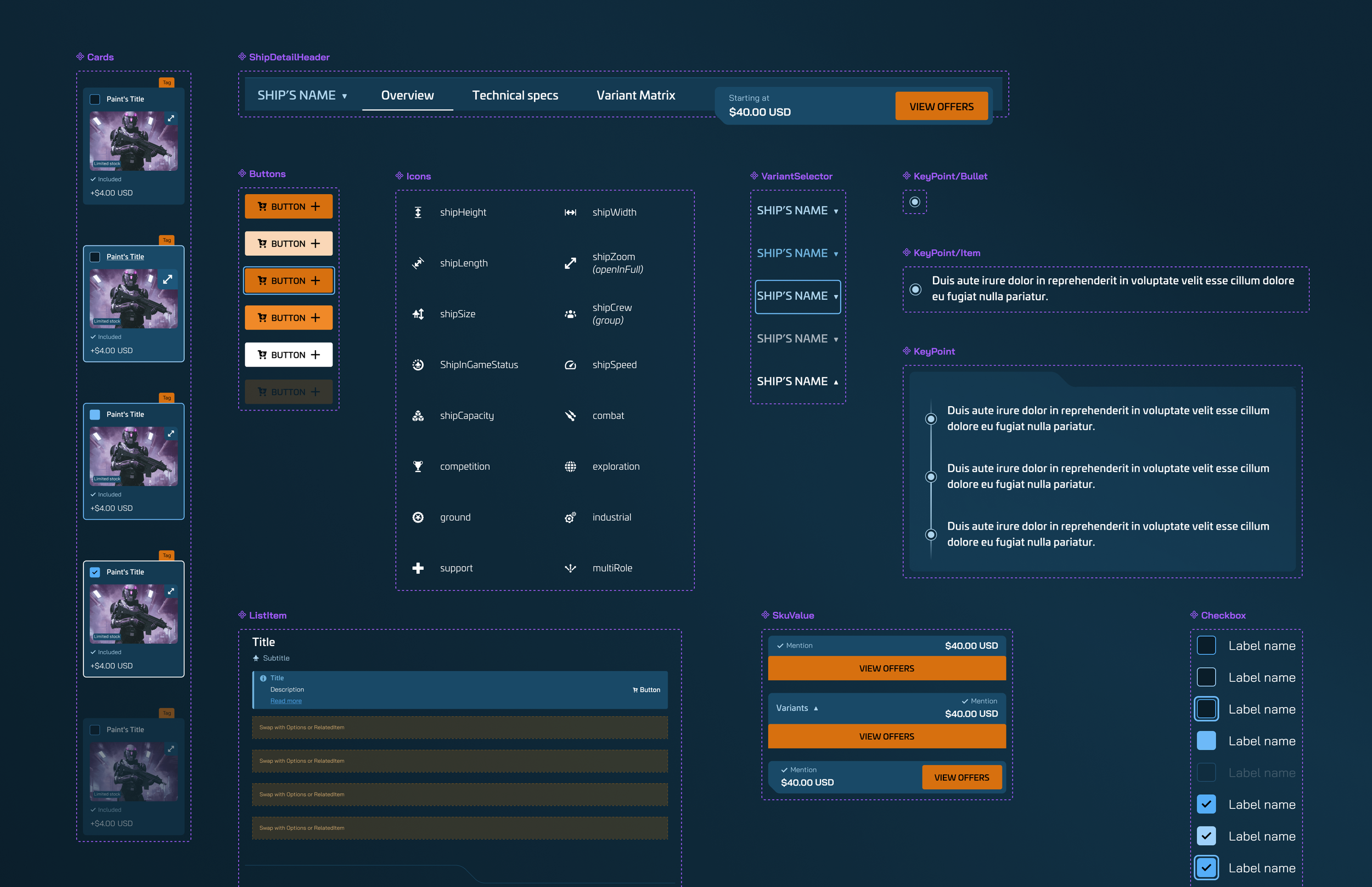
I focused on building scalable components within the design system to ensure consistency and efficiency. This involved close collaboration with developers through regular meetings to align on naming conventions, structure, and technical feasibility. I created all necessary component variants and defined their interaction states, allowing for smoother implementation and reducing ambiguity during development. This process strengthened the bridge between design and engineering, ensuring a shared language and a unified product experience.
Component Documentation
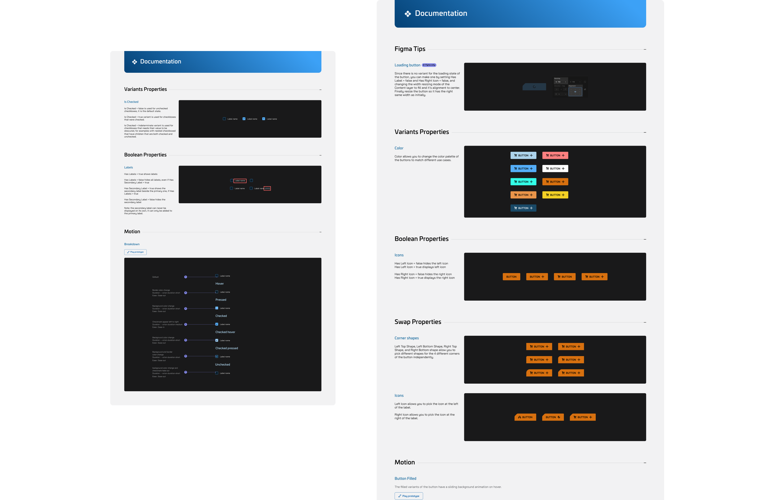
To support developers and QA teams, I created detailed documentation for each component integrated into the design system. This documentation outlines the component’s purpose, structure, and behavior across all possible states and variants. It also includes usage guidelines, interaction patterns, and motion specifications to ensure consistency in implementation. By providing clear examples and edge cases, the documentation helps developers anticipate technical constraints and allows QA to validate every scenario with precision.
5. Delivery & Collaboration


